# Rule
Direction
The configuration method name of the component generator is the same as the configuration item of the rule, and the configuration Parameters are also the same
# Example
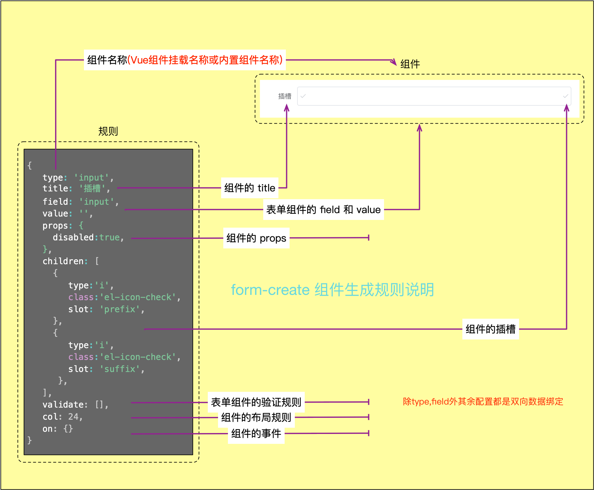
For example, to generate an input component:
# Basic attributes
# type
- Type:
String - Description: Set the name of the generated component
# field
- Type:
String - Description: Set the field name of the form component, Custom component can not be configured
# title
- Type:
String|Object - Description: The name of the field, can not be set
# name
- Type:
String - Description: Field name of custom component
# value
- Type:
any - Description: Field values of form components, custom components can be set without setting
# className
- Type:
String - Description: Set the
classofForm Item
Not recommended,It is recommended to use the wrap configuration
# info v0.0.4+
- Type:
String|Object - Description: Set the prompt information of the component
- Global configuration instructions: iview | element-ui | ant-design-vue
- Configuration instructions
# native
- Type:
Bool - Description: Whether to generate components as they are, not nested in
Form Item
# hidden v1.0.5+
- Type:
Bool - Description: Set whether the component is generated
# display v2.5.0+
- Type:
Bool - Description: Set whether the component is displayed
# prefix v2.5.0+
- Type:
string|Object - Description: Set the prefix of the component
- Configuration instructions
# suffix v2.5.0+
- Type:
string|Object - Description: Set the suffix of the component
- Configuration instructions
# Extension attributes
# validate
- Type:
Array - Description: Set validation rules for form components
- Configuration instructions
# options
- Type:
Array - Description: Set options for components such as
radio,select,checkbox, etc.
# inject
- Type:
any - Description: Set custom data for event injection
- Configuration instructions
# effect
- Type:
Object - Description: Set custom properties
- Configuration instructions
# update
- Type:
Function - Description: Set update callback
- Configuration instructions
# link
- Type:
Array - Description: After the field configured in the link changes, trigger the update of the component
- Configuration instructions
# col
- Type:
Object - Description: Set the layout rules of the component
- Configuration instructions
# wrap
- Type:
Object - Description: Set the
FormItemrule of the component - Configuration instructions
# sync
- Type:
Array - Description: Configure
prop.sync, set the two-way binding of properties inprops
# control
- Type:
Object - Description: Control the display of other components
- Configuration instructions
# children
- Type:
Array<rule|string|maker> - Description: Set the slot of the parent component, the default is
default. Can be used with theslotconfiguration item
- Example 1
formCreate.maker.create('button').children([
   'Button content'
]);
- Example 2
maker.input('text','text','text').children([
    Maker.create('span').children(['append']).slot('append')
])
- Example 3
formCreate.maker.create('i-row').children([
  formCreate.maker.create('i-col').props('span',12).children([
    formCreate.maker.template('<span>custom component</span>', () => new Vue)
  ]),
]);
# emit
- Type:
Array - Description: The name of the event triggered by the
emitmethod, which can be used with theemit PrefixParameter
Example:
// The following three ways have the same effect

rules = [{//Emit to trigger the change event
    field:'goods_name',
    //...
    emit:['change']
},{// Custom emit event prefix, the default is the field field
    field:'goods_info',
    //...
    emit:['change'],
    emitPrefix:'gi'
},{// Write callback methods directly in the rules
     field:'goods_tag',
     //...
     on:{
         change:function() {
           //TODO
         }
     }
 }]
<div id="app">
  <form-create :rule="rules" @goods-name-change="change" @gi-change="change"></form-create>
</div>
new Vue({
   el:'#app',
    data: {
        rules:rules
    },
    methods:{
        change:function(){
            //TODO
        }
    }
})
# nativeEmit
Type:
ArrayDescription: The name of the original event triggered by the
emitmethod, which can be used with theemit PrefixParameter
# emitPrefix
- Type:
Object - Description: Custom component
emitevent prefix - Default: Component
fieldfield - Configuration instructions
# Template attributes
The template component must set the following Parameters, other components do not need to be set
# template
- Type:
string - Description: Generate template for template component
# vm
- Type:
Vue|Function - Description: Vue sample object for template component for parsing template
# Common attributes
# props
- Parameters:
Object - Description: Set the component's
props
# class
- Parameters:
Object|String|Array - Description: Set the
classof the component
# style
- Parameters:
Object|String - Description: Set the
styleof the component
# attrs
- Parameters:
Object - Description: Set the normal HTML features of the component
# domProps
- Parameters:
Object - Description: Set the DOM attribute of the component
# on
- Parameters:
Object - Description: Set component events
# nativeOn
- Parameters:
Object - Description: Native events of the listening component
# directives
- Parameters:
Array - Description: Set custom instructions for components
# scopedSlots
- Parameters:
Object - Description: Set the slot of the component
# slot
- Parameters:
String - Description: Set the slot name of the component. If the component is a subcomponent of another component, specify a name for the slot.