

Generation Rules
In FormCreate, component generation rules define how to generate form components through JSON configuration. Understanding and using these rules lets you flexibly create and control various form elements.
The following is a simple example of how to generate an input component through JSON:
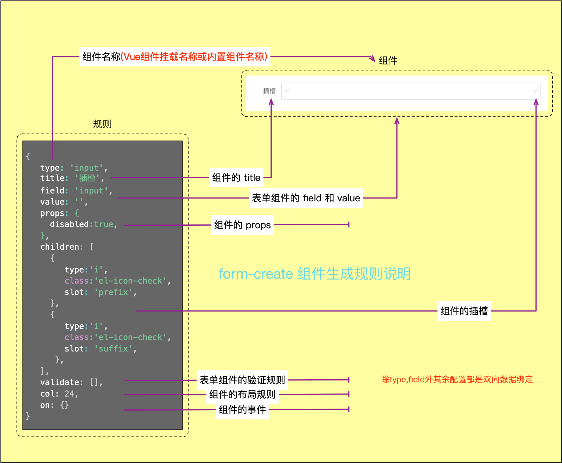
Component Generation Rules Explanation
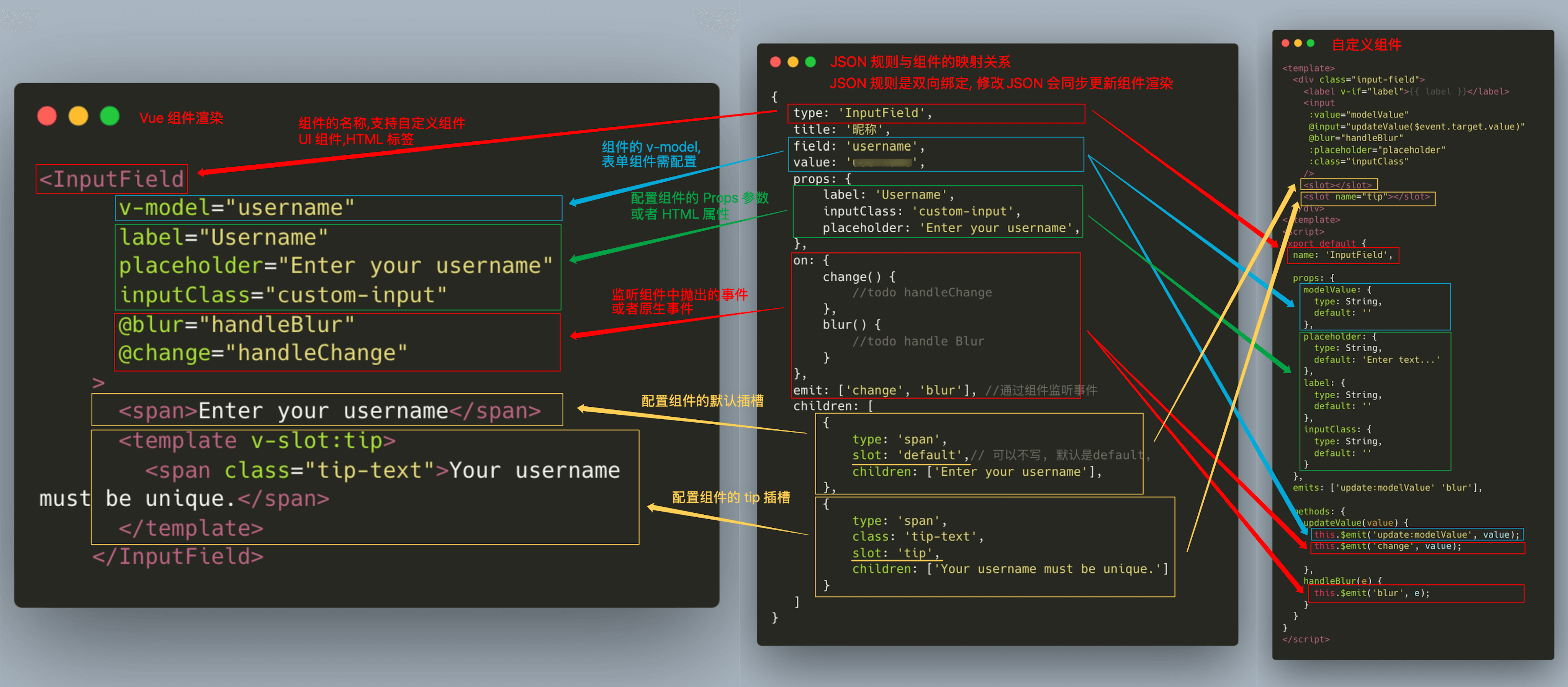
JSON Rules and Component Mapping Relationship
Note
Form parameters must be wrapped with ref to achieve reactivity and cannot be placed directly in computed properties. The rule cannot be placed in computed properties!!!
When rendering forms in dialogs, deep copy the rules before use to avoid data pollution issues from multiple references.
Force component re-rendering by modifying the key field.
Do not mix generation rules between different UI frameworks, as this may cause compatibility issues.
Data Structure
type Rule = {
    // Component name to generate, e.g., 'input', 'select', etc.
    type: string;
    // Form field name for data binding
    field?: string;
    // Unique identifier for the component
    name?: string;
    // Field label
    title?: string;
    // Component hint information
    info?: string;
    // Default value of the component
    value?: any;
    // Whether to generate the component as-is, not nested in `FormItem`
    native?: boolean;
    // Component property configuration
    props?: Object;
    // Component inline styles
    style?: string | Object;
    // Component class style classes
    class?: string | Array<string>;
    // Set component id
    id?: string | Array<string>;
    // Component event handler functions
    on?: { [key: string]: Function | Function[] };
    // Component generation lifecycle callbacks
    hook?: { [key: string]: Function | Function[] };
    // Slot name for component nesting
    slot?: string;
    // Component key, usually used as a unique identifier in list rendering
    key?: string;
    // Whether required
    $required?: boolean | string | Object;
    // Component options list, applicable to `radio`, `select`, `checkbox`, etc.
    options?: Array<any>;
    // Target property where options are inserted, defaults to `props.data`
    optionsTo?: string;
    // Whether to generate the component as-is without wrapping in FormItem
    native?: boolean;
    // Whether to hide the component (DOM element will not be rendered)
    hidden?: boolean;
    // Whether to display the component (DOM is rendered but may not be visible)
    display?: boolean;
    // Whether to enable event injection
    inject?: boolean|Object;
    // Whether to ignore this field when submitting the form, when equal to 'hidden', ignore when component is hidden
    ignore?: boolean| 'hidden';
    // Component validation rules
    validate?: Object[];
    // Child component list for nesting child components
    children?: Rule[];
    // Component linkage control, controls the display of other components
    control?: Array;
    // Dynamically calculate specified fields of the component, automatically recalculate and update results when dependent values change
    computed?: Object;
    // FormItem configuration
    wrap?: Object;
    // Set component layout rules
    col?: Object;
    // Custom properties, such as remote data fetching, etc.
    effect?: {
        // Load remote data
        fetch?: Object,
    };
    // Set component prefix content, usually used to display icons or text before input box
    prefix?: string|Rule;
    // Set component suffix content, usually used to display icons or text after input box
    suffix?: string|Rule;
    // Set component custom directives
    directives?: object;
    // Whether to cache the component, only trigger rendering once
    cache?: boolean;
    // Set callback function for dynamically updating component content
    update?: (value:any, api:Api, origin:{
        // init triggered on initialization, link triggered on association, value triggered on value change
        origin: 'change' | 'init' | 'link';
        // Field name that triggered the association
        linkField?: string;
    }) => bool|undefined;
    // Render slots through functions
    renderSlots?: {
        default?: (scope) => Vnode | Vnode[];
        [slot: string]: (scope) => Vnode | Vnode[];
    }
    // Configure which field changes will trigger the current component's `update` callback
    link?: string[];
    // Set the names of properties in `props` that need two-way binding
    sync?: string[];
    // Event names to listen to using `emit` method
    emit?: string[];
    // Custom component `emit` event prefix, default is the component's `field` field
    emitPrefix?: string;
    // Define custom component for rendering current rule
    component?: boolean;
    // Other extended properties
    [key: string]: any;
}
Basic Configuration
| Property Name | Type | Description |
|---|---|---|
| type | string | Set the component type name to generate, e.g., 'input', 'select', etc. It supports configuring standard form components, custom Vue components, and HTML tags. |
| field | string | Form component field name, usually used for data binding. Each form item's field should be unique, used to associate the component's value with form data. |
| title | string|Rule | Field title, usually displayed as form label. |
| name | string | Set component alias for retrieving rules through API. |
| value | any | Component default value. |
| info | string|Rule | Set component hint information Configuration Guide |
| native | boolean | Whether to generate component as-is, not nested in FormItem. |
| hidden | bool | Whether to hide the component (DOM element will not be rendered). |
| display | bool | Whether to display the component (DOM is rendered but may not be visible), hiding will also trigger form validation. |
| prefix | string|Rule | Set component prefix content, usually used to display icons or text before input box Configuration Guide |
| suffix | string|Rule | Set component suffix content, usually used to display icons or text after input box Configuration Guide |
| ignore | boolean|'hidden' | Whether to ignore this field when submitting the form, when equal to 'hidden', ignore when component is hidden |
General Configuration
| Property Name | Type | Description |
|---|---|---|
| props | object | Set component props properties to control component behavior. The configuration of props depends on the specific component's properties, such as placeholder, maxlength, etc. for input components. |
| class | object|string|Array | Set component class for custom styling. |
| id | string | Set component id |
| style | object|string | Set component inline styles. |
| on | object | Set component event listeners, e.g., input event, change event, etc. |
| directives | object | Set component custom directives. |
| slot | string | Set component slot name, applicable to nested components. |
Extended Configuration
| Property Name | Type | Description |
|---|---|---|
| cache | bool | Whether to cache the component, only trigger rendering once. When set to true, the component will only render once and will not re-render due to data changes. |
| computed | object | Dynamically calculate specified fields of the component, automatically recalculate and update results when dependent values change |
| component | object|Component | Define custom component for rendering current rule. You can specify custom components in rules without global registration |
| renderSlots | Object | Render component slots through functions |
| validate | Array | Set form component validation rules. You can specify multiple validation rules to ensure the correctness of form input |
| options | Array|Function | Set options selection items for components like radio, select, checkbox, etc. |
| optionsTo | string | Set the position where options configuration item is inserted |
| inject | bool|Object | Whether to enable event injection |
| effect | object | Set custom properties for extending component functionality or interacting with external systems |
| update | function | Set update callback function for dynamically updating component content Configuration Guide |
| link | Array | Configure which field changes will trigger the current component's update callback |
| col | object | Set component layout rules, usually used in grid systems |
| wrap | object | Set component FormItem configuration to control FormItem behavior and styles |
| sync | Array | Configure prop.sync, set the names of properties in props that need two-way binding |
| control | object | Control the display and hiding of other components. Applicable to form linkage scenarios Configuration Guide |
| children | Array<rule|string|maker> | Set component slot content, default is default |
| emit | Array | Event names to listen to using emit method, can be used with emitPrefix parameter |
| emitPrefix | object | Custom component emit event prefix, default is the component's field field |
| hook | object | Set component lifecycle events |
Examples
Slot Configuration
Configure the prepend slot of the input component
const rule = {
    type: 'input',
    children: [
        {
            type: 'span',
            slot: 'prepend',
            children: ['https://']
        }
    ]
}
Style Configuration
Configure text styles
const rule = {
    type: 'span',
    style: {
        color: 'red',
    },
    class: 'text-red',
    children: ['https://']
}
Directive Configuration
Configure the pin directive of the component
// Custom directive
const pin = {
    mounted() { /* ... */ },
    updated() { /* ... */ }
}


// <div v-pin:top.animate="200"></div>
const rule = {
    type: 'div',
    directives: {
        pin: {
            value: 200,
            arg: 'top',
            modifiers: { animate: true }
        }
    }
}
Event Configuration
Configure the change event of the input component
const rule = {
    type: 'input',
    on: {
       change() {
           // todo
       }
    }
}
Hide Component
// <el-input v-if="false" />
const rule = {
    type: 'input',
    hidden: true
}// <el-input v-show="false" />
const rule = {
type: 'input',
display: false
}Configure Label Style
Change input component label text to red
const rule = {
    type: 'input',
    wrap: {
        class: 'text-red',
        style: {
            color: 'red'
        }
    }
}
Component Validation
Configure input component to be required and must be 8 digits
const rule = {
    type: 'input',
    field: 'ID',
    validate: [
        {reuqired: true, message: 'Enter ID'},
        {len: 8, message: 'Must enter 8-digit ID'}
    ]
}
v-model
When the component supports modelValue and update:modelValue, component data can be obtained through the combination of field and value.
// <el-input v-model="formData.ID" />
const rule = {
    type: 'el-input',
    field: 'ID',
    value: ''
}
Configure Component Options via options
Configure selection component option data through the options field
// <fc-select options="[]" />
const rule = {
    type: 'fc-select',
    options:  [],
    optionsTo: 'props.options'
}
Modify Component Layout
Adjust component layout configuration to achieve a layout with two input boxes displayed side by side per row.
// <el-col :span="12"><elInput v-model="formData.input1"></el-col>
// <el-col :span="12"><elInput v-model="formData.input2"></el-col>
const rule = [
    {
        type: 'input',
        field: 'input1',
        col: {
            span: 12,
        }
    },
    {
        type: 'input',
        field: 'input2',
        col: {
            span: 12,
        }
    }
]