

DatePicker
Rule
Basic Example
js
const rule = {
    type: 'datePicker',
    title: 'Year/Month/Day Selection',
    field: 'date',
    value: '2024-06-12',
    props: {
        title: 'Year/Month/Day Selection',
    }
}
Props Configuration Examples
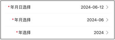
Year/Month/Day Selection
js
const rule = {
    type: 'datePicker',
    title: 'Event Date',
    field: 'date',
    value: '2024-06-12',
    props: {
        title: 'Select Date',
        columnsType: ['year', 'month', 'day'],
    }
}
Year/Month Selection
js
const rule = {
    type: 'datePicker',
    title: 'Year/Month Selection',
    field: 'month',
    value: '2024-06',
    props: {
        title: 'Select Year/Month',
        columnsType: ['year', 'month']
    }
}
Year Selection
js
const rule = {
    type: 'datePicker',
    title: 'Year',
    field: 'year',
    value: '2024',
    props: {
        title: 'Select Year',
        columnsType: ['year'],
    }
}
Month/Day Selection
js
const rule = {
    type: 'datePicker',
    title: 'Month/Day Selection',
    field: 'monthDay',
    value: '06-12',
    props: {
        title: 'Select Month/Day',
        columnsType: ['month', 'day'],
    }
}
Limit Date Range
js
const rule = {
    type: 'datePicker',
    title: 'Appointment Date',
    field: 'date',
    value: '',
    props: {
        title: 'Select Date',
        minDate: new Date(),
        maxDate: new Date(2025, 11, 31),
    }
}
Events Examples
Handle Date Changes
js
const rule = {
    type: 'datePicker',
    title: 'Event Date',
    field: 'date',
    value: '',
    props: {
        title: 'Select Date',
    },
    on: {
        confirm: (result) => {
            console.log('Confirmed selection:', result);
        },
        cancel: () => {
            console.log('Cancelled selection');
        },
        change: (result) => {
            console.log('Date changed:', result);
        },
    },
}
Complete configuration items:Vant_DatePicker
value: String
Props
| Parameter | Description | Type | Default Value |
|---|---|---|---|
| disabled | Whether to disable | boolean | false |
| columns-type | Option types, array composed of year, month, and day | string[] | ['year', 'month', 'day'] |
| min-date | Minimum selectable time, accurate to day | Date | Ten years ago |
| max-date | Maximum selectable time, accurate to day | Date | Ten years later |
| title | Top bar title | string | '' |
| confirm-button-text | Confirm button text | string | Confirm |
| cancel-button-text | Cancel button text | string | Cancel |
| show-toolbar | Whether to show top bar | boolean | true |
| loading | Whether to show loading state | boolean | false |
| readonly | Whether it is in readonly state, cannot switch options in readonly state | boolean | false |
| filter | Option filter function | (type: string, options: PickerOption[]) => PickerOption[] | - |
| formatter | Option formatter function | (type: string, option: PickerOption) => PickerOption | - |
| option-height | Option height, supports px vw vh rem units, default px | number | string | 44 |
| visible-option-num | Number of visible options | number | string | 6 |
| swipe-duration | Duration of inertial scrolling when swiping quickly, unit ms | number | string | 1000 |
Events
| Event Name | Description | Callback Parameters |
|---|---|---|
| confirm | Triggered when confirm button is clicked | { selectedValues, selectedOptions, selectedIndexes } |
| cancel | Triggered when cancel button is clicked | { selectedValues, selectedOptions, selectedIndexes } |
| change | Triggered when option changes | { selectedValues, selectedOptions, selectedIndexes, columnIndex } |