

TimePicker
Rule
Basic Example
js
const rule = {
type: 'timePicker',
title: 'Time Selection',
field: 'time',
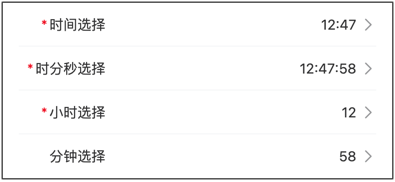
value: '12:47',
props: {
title: 'Time Selection',
}
}Props Configuration Examples
Hour/Minute Selection
js
const rule = {
    type: 'timePicker',
    title: 'Event Time',
    field: 'time',
    value: '12:47',
    props: {
        title: 'Select Time',
        columnsType: ['hour', 'minute'],
    }
}
Hour/Minute/Second Selection
js
const rule = {
    type: 'timePicker',
    title: 'Precise Time',
    field: 'time',
    value: '12:47:58',
    props: {
        title: 'Select Time',
        columnsType: ['hour', 'minute', 'second']
    }
}
Hour Selection
js
const rule = {
    type: 'timePicker',
    title: 'Hour',
    field: 'hour',
    value: '12',
    props: {
        title: 'Select Hour',
        columnsType: ['hour']
    }
}
Minute Selection
js
const rule = {
    type: 'timePicker',
    title: 'Minute',
    field: 'minute',
    value: '58',
    props: {
        title: 'Select Minute',
        columnsType: ['minute']
    }
}
Limit Time Range
js
const rule = {
    type: 'timePicker',
    title: 'Working Time',
    field: 'workTime',
    value: '09:00',
    props: {
        title: 'Select Time',
        minTime: '09:00:00',
        maxTime: '18:00:00',
    }
}
Events Examples
Handle Time Changes
js
const rule = {
    type: 'timePicker',
    title: 'Event Time',
    field: 'time',
    value: '12:47',
    props: {
        title: 'Select Time',
    },
    on: {
        confirm: (result) => {
            console.log('Confirmed selection:', result);
        },
        cancel: () => {
            console.log('Cancelled selection');
        },
        change: (result) => {
            console.log('Time changed:', result);
        },
    },
}
Complete configuration items:Vant_TimePicker
value :String
Props
| Parameter | Description | Type | Default Value |
|---|---|---|---|
| disabled | Whether to disable | boolean | false |
| columns-type | Option types, array composed of hour, minute, and second | string[] | ['hour', 'minute'] |
| min-hour | Minimum selectable hour | number | string | 0 |
| max-hour | Maximum selectable hour | number | string | 23 |
| min-minute | Minimum selectable minute | number | string | 0 |
| max-minute | Maximum selectable minute | number | string | 59 |
| min-second | Minimum selectable second | number | string | 0 |
| max-second | Maximum selectable second | number | string | 59 |
| min-time | Minimum selectable time, format reference 07:40:00, when used, min-hour min-minute min-second will not take effect | string | - |
| max-time | Maximum selectable time, format reference 10:20:00, when used, max-hour max-minute max-second will not take effect | string | - |
| title | Top bar title | string | '' |
| confirm-button-text | Confirm button text | string | Confirm |
| cancel-button-text | Cancel button text | string | Cancel |
| show-toolbar | Whether to show top bar | boolean | true |
| loading | Whether to show loading state | boolean | false |
| readonly | Whether it is in readonly state, cannot switch options in readonly state | boolean | false |
| filter | Option filter function | (type: string, options: PickerOption[], values: string[]) => PickerOption[] | - |
| formatter | Option formatter function | (type: string, option: PickerOption) => PickerOption | - |
| option-height | Option height, supports px vw vh rem units, default px | number | string | 44 |
| visible-option-num | Number of visible options | number | string | 6 |
| swipe-duration | Duration of inertial scrolling when swiping quickly, unit ms | number | string | 1000 |
Events
| Event Name | Description | Callback Parameters |
|---|---|---|
| confirm | Triggered when confirm button is clicked | { selectedValues, selectedOptions, selectedIndexes } |
| cancel | Triggered when cancel button is clicked | { selectedValues, selectedOptions, selectedIndexes } |
| change | Triggered when option changes | { selectedValues, selectedOptions, selectedIndexes, columnIndex } |