

Rate
Rule
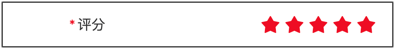
Basic Example
js
const rule = {
    type: 'rate',
    title: 'Rating',
    field: 'rate',
    value: 5,
    props: {
        disabled: false,
    }
}
Props Configuration Examples
Allow Half Selection
js
const rule = {
    type: 'rate',
    title: 'Product Rating',
    field: 'rating',
    value: 4.5,
    props: {
        allowHalf: true,
        count: 5,
    }
}
Custom Icon and Color
js
const rule = {
    type: 'rate',
    title: 'Product Rating',
    field: 'rating',
    value: 4,
    props: {
        icon: 'like',
        voidIcon: 'like-o',
        color: '#ffd21e',
        voidColor: '#c8c9cc',
    }
}
Clearable
js
const rule = {
    type: 'rate',
    title: 'Product Rating',
    field: 'rating',
    value: 0,
    props: {
        clearable: true,
        allowHalf: true,
    }
}
Custom Total Count
js
const rule = {
    type: 'rate',
    title: 'Recommendation Level',
    field: 'level',
    value: 3,
    props: {
        count: 10,
    }
}
Events Examples
Handle Rating Changes
js
const rule = {
    type: 'rate',
    title: 'Product Rating',
    field: 'rating',
    value: 0,
    props: {
        allowHalf: true,
    },
    on: {
        change: (currentValue) => {
            console.log('Rating changed:', currentValue);
        },
    },
}
Show Feedback After Rating
js
const rule = {
    type: 'rate',
    title: 'Product Rating',
    field: 'rating',
    value: 0,
    props: {
        count: 5,
    },
    inject: true,
    on: {
        change: ($inject, currentValue) => {
            // Fill comment based on rating
            const comments = {
                1: 'Product quality is very poor, not recommended',
                2: 'Product is average, needs improvement',
                3: 'Product is okay, basically satisfied',
                4: 'Product is good, worth recommending',
                5: 'Product is excellent, highly recommended',
            };
            if (currentValue >= 1 && currentValue <= 5) {
                $inject.api.setValue('comment', comments[Math.ceil(currentValue)]);
            }
        },
    },
}
Complete configuration items:Vant_Rate
value :Number
Props
| Parameter | Description | Type | Default Value |
|---|---|---|---|
| count | Total number of icons | number | string | 5 |
| size | Icon size, default unit is px | number | string | 20px |
| gutter | Icon spacing, default unit is px | number | string | 4px |
| color | Color when selected | string | #ee0a24 |
| void-color | Color when not selected | string | #c8c9cc |
| disabled-color | Color when disabled | string | #c8c9cc |
| icon | Icon name or image link when selected, same as Icon component's name attribute | string | star |
| void-icon | Icon name or image link when not selected, same as Icon component's name attribute | string | star-o |
| icon-prefix | Icon class name prefix, same as Icon component's class-prefix attribute | string | van-icon |
| allow-half | Whether to allow half selection | boolean | false |
| clearable | Whether to allow clearing by clicking again | boolean | false |
| readonly | Whether it is in readonly state, cannot modify rating in readonly state | boolean | false |
| disabled | Whether to disable rating | boolean | false |
| touchable | Whether to allow selecting rating through swipe gesture | boolean | true |
Events
| Event Name | Description | Callback Parameters |
|---|---|---|
| change | Event triggered when current rating value changes | currentValue: number |