

Input
Rule
Basic Example
js
const rule = {
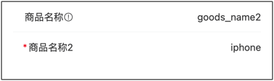
type:"input",
title:"Product Name",
field:"goods_name",
value:"iphone 7",
props: {
placeholder: 'Please enter product name',
disabled: false,
}
}Props Configuration Examples
Single Line Input (text)
js
const rule = {
    type:"input",
    title:"Username",
    field:"username",
    props: {
        placeholder: 'Please enter username',
        clearable: true,
        leftIcon: 'user-o',
    }
}
Multi-line Input (textarea)
js
const rule = {
    type: 'field',
    title: 'Product Introduction',
    field: 'goods_info',
    value: '',
    props: {
        placeholder: 'Please enter product introduction',
        type: 'textarea',
        autosize: true,
        rows: 4,
    }
}
Password Input (password)
js
const rule = {
    type:"input",
    title:"Password",
    field:"password",
    props: {
        type: 'password',
        placeholder: 'Please enter password',
        clearable: true,
    }
}
Number Input (number/digit)
js
const rule = {
    type:"input",
    title:"Phone Number",
    field:"phone",
    props: {
        type: 'digit',
        placeholder: 'Please enter phone number',
        maxlength: 11,
        clearable: true,
    }
}
Clearable Input
js
const rule = {
    type:"input",
    title:"Search Keyword",
    field:"keyword",
    props: {
        placeholder: 'Please enter search keyword',
        clearable: true,
        clearTrigger: 'always',
        leftIcon: 'search',
    }
}
Show Word Count
js
const rule = {
    type: 'field',
    title: 'Product Description',
    field: 'description',
    props: {
        type: 'textarea',
        placeholder: 'Please enter product description',
        maxlength: 200,
        showWordLimit: true,
    }
}
Disabled and Readonly
js
const rule = {
    type:"input",
    title:"Order Number",
    field:"order_no",
    value:"ORD20240101001",
    props: {
        disabled: true,
        // or use readonly: true,
    }
}
Events Examples
Handle Input and Focus Events
js
const rule = {
    type:"input",
    title:"Search Keyword",
    field:"keyword",
    props: {
        placeholder: 'Please enter search keyword',
        clearable: true,
    },
    on: {
        input: (value) => {
            console.log('Input value changed:', value);
        },
        blur: (event) => {
            console.log('Field lost focus:', event);
        },
        focus: (event) => {
            console.log('Field gained focus:', event);
        },
        clear: (event) => {
            console.log('Input cleared');
        },
    },
}
Real-time Search (input event)
js
const rule = {
    type:"input",
    title:"Search Products",
    field:"keyword",
    props: {
        placeholder: 'Please enter product name to search',
        clearable: true,
        leftIcon: 'search',
    },
    inject: true,
    on: {
        input: ($inject, value) => {
            // Real-time search: trigger search as user types
            if (value && value.length >= 2) {
                // Call search API
                searchProducts(value).then(res => {
                    // Update search results
                    $inject.api.setValue('searchResults', res.data);
                });
            }
        },
    },
}
Linkage Update Other Fields (input event)
js
const rule = [
    {
        type:"input",
        title:"Product Name",
        field:"goods_name",
        props: {
            placeholder: 'Please enter product name',
        },
        inject: true,
        on: {
        input: ($inject, value) => {
            // Auto-generate product code when product name changes
            if (value) {
                const code = 'GD' + value.substring(0, 3).toUpperCase() + Date.now().toString().slice(-6);
                $inject.api.setValue('goods_code', code);
            }
        },
        },
    },
    {
        type:"input",
        title:"Product Code",
        field:"goods_code",
        props: {
            disabled: true,
        },
    },
]
Complete configuration items:Vant_Input
value :String
Props
| Parameter | Description | Type | Default Value |
|---|---|---|---|
| v-model | Current input value | number | string | - |
| label | Text on the left side of input box | string | - |
| name | Name, used as identifier when submitting form | string | - |
| id | Input box id, also sets the for attribute of label | string | van-field-n-input |
| type | Input box type, supports all type attributes of native input tag, additionally supports digit type | FieldType | text |
| size | Size, optional values are large normal | string | - |
| maxlength | Maximum number of input characters | number | string | - |
| placeholder | Placeholder text for input box | string | - |
| border | Whether to show inner border | boolean | true |
| disabled | Whether to disable input box | boolean | false |
| readonly | Whether it is in readonly state, cannot input content in readonly state | boolean | false |
| colon | Whether to add colon after label | boolean | false |
| required | Whether to show form required asterisk | boolean | 'auto' | null |
| center | Whether to vertically center content | boolean | false |
| clearable | Whether to enable clear icon, clicking clear icon will clear input box | boolean | false |
| clear-icon | Clear icon name or image link, same as Icon component's name attribute | string | clear |
| clear-trigger | When to show clear icon, always means show when input box is not empty, focus means show when input box is focused and not empty | FieldClearTrigger | focus |
| clickable | Whether to enable click feedback | boolean | false |
| is-link | Whether to show right arrow and enable click feedback | boolean | false |
| autofocus | Whether to auto focus, iOS system does not support this attribute | boolean | false |
| show-word-limit | Whether to show word count, requires setting maxlength attribute | boolean | false |
| error | Whether to mark input content in red | boolean | false |
| error-message | Bottom error message text, not shown when empty | string | - |
| error-message-align | Error message text alignment, optional values are center right | FieldTextAlign | left |
| formatter | Input content formatting function | (val: string) => string | - |
| format-trigger | When formatting function is triggered, optional value is onBlur | FieldFormatTrigger | onChange |
| arrow-direction | Arrow direction, optional values are left up down | string | right |
| label-class | Additional class name for left text | string | Array | object | - |
| label-width | Left text width, default unit is px | number | string | 6.2em |
| label-align | Left text alignment, optional values are center right top | FieldTextAlign | left |
| input-align | Input box alignment, optional values are center right | FieldTextAlign | left |
| autosize | Whether to adapt to content height, only effective for textarea, can pass object, such as { maxHeight: 100, minHeight: 50 }, unit is px | boolean | FieldAutosizeConfig | false |
| left-icon | Left icon name or image link, same as Icon component's name attribute | string | - |
| right-icon | Right icon name or image link, same as Icon component's name attribute | string | - |
| icon-prefix | Icon class name prefix, same as Icon component's class-prefix attribute | string | van-icon |
Events
| Event Name | Description | Callback Parameters |
|---|---|---|
| focus | Triggered when input box gains focus | event: Event |
| blur | Triggered when input box loses focus | event: Event |
| clear | Triggered when clear button is clicked | event: MouseEvent |
| click | Triggered when component is clicked | event: MouseEvent |
| clickInput | Triggered when input area is clicked | event: MouseEvent |
| clickLeftIcon | Triggered when left icon is clicked | event: MouseEvent |
| clickRightIcon | Triggered when right icon is clicked | event: MouseEvent |
| startValidate | Triggered when form validation starts | - |
| endValidate | Triggered when form validation ends | { status: string, message: string } |